

AT A GLANCE
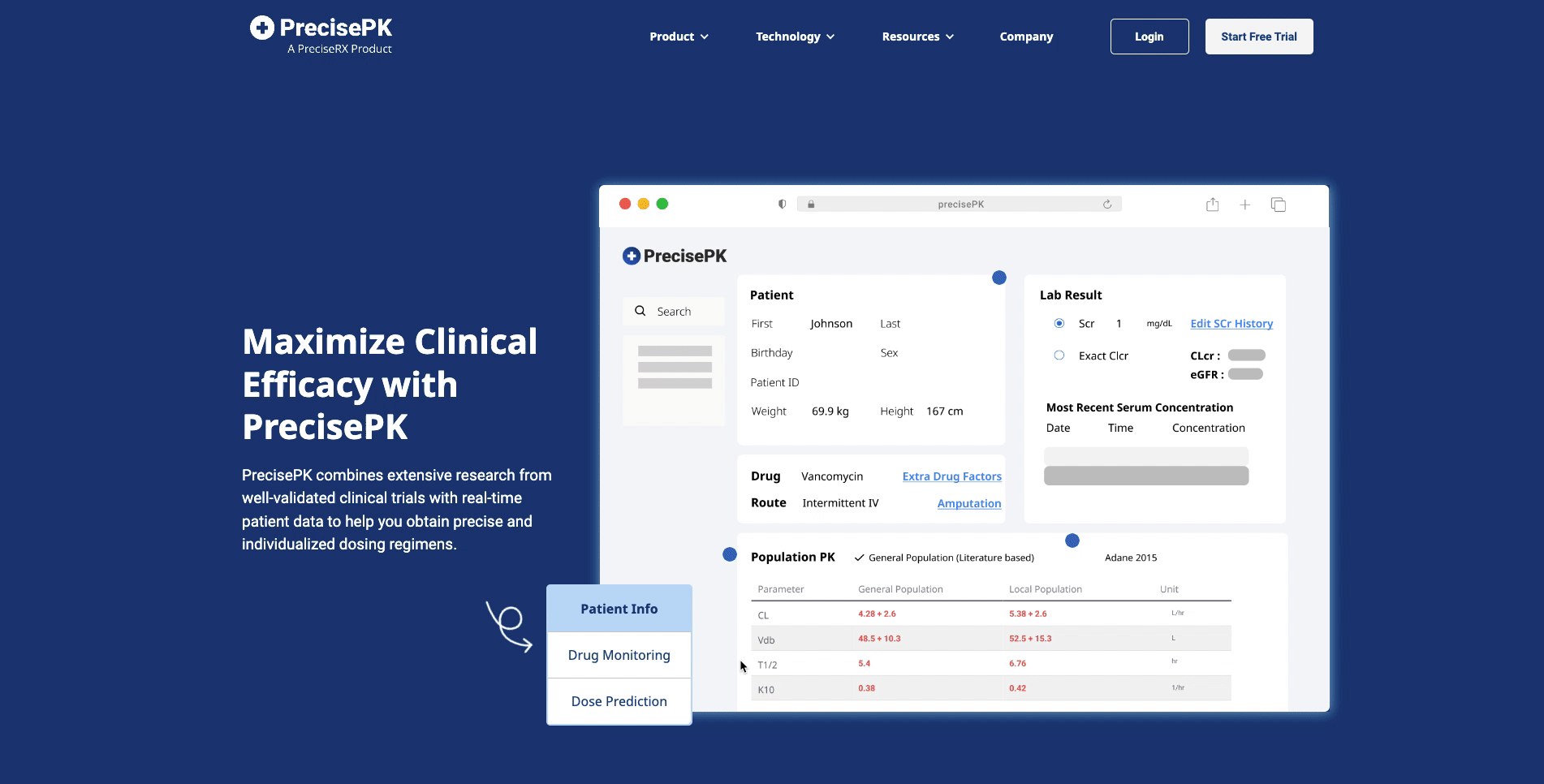
PrecisePK's website serves as a gateway for users seeking to integrate a Bayesian dosing software into their hospitals. However, the existing product page has become outdated over time, failing to effectively showcase the full potential of PrecisePK’s features. In this product page redesign project, the aim was to transform the outdated page into a visually appealing and user-centric design that effectively answers questions about what our product is.
As the UX Designer for the project, I collaborated with the sales & operations team and business development specialist to redesign the product page and its contents. My goal for this project was to simplify the product page for the user , while ensuring the product features were well communicated.
THE TEAM
Etania Cheng - UX Designer, Graphic Designer
Katie Ninh - Sales & Operations Manager
Christy Xie - Accounts Manager
Vivian Liu - Business Development Specialist
TOOLS
Figma
TIMELINE
Ongoing
Images in this case study are abridged and do not represent the program exactly due to confidentiality agreements.
PROCESS
First of all, what problems were users experiencing?
To fully understand the pain points on the website, I conducted 4 user interviews to understand what could potentially confuse users on the existing product page.
The Problems
To start, I had to understand what issues were present and understand a user point of view and what they gather from going over the existing product page.
Busy and lengthy. The existing product page contained features of PrecisePK software, however it also included information that was already shown other pages, overwhelming the user.
Confusing user interface. Some buttons were interactable, however it’s not clear to the user unless you inform them.
Overwhelming. Utilizing gifs for showing product features is helpful, but because of the close proximity of the features and the descriptions, it affects the user’s ability to focus on one specific area.
“There’s too much going on. If you scroll to a section of the product features section, you can see 3 different videos moving at the same time. I also only find the product features part useful since I’m on this page to understand the product.”
- Sherman
The font is kinda random, like this bolded font here (Bolded Drug in Drug Module). Why is it even bolded and why aren’t the other ones bolded?
- Harrison
“I didn’t even know this initial product feature image was interactable. I thought it was just a big picture to get your attention.”
- Phoebe
“I know I’m learning more about your product and it makes sense that you would put ROI here but I already saw this on the home page, so it’s kind of repetitive.”
- Jenny
The Challenges
Challenge #1: What needs to be deleted or changed and what needs to be kept?
To elevate the user experience on the product page, there was a need to streamline the content while retaining the information to ensure users learn about the product. The emphasis was on removing any redundant information and optimizing the space of the page to only contain information about the product.
Challenge #2: What needs to be redesigned or changed to clean the user interface of the page?
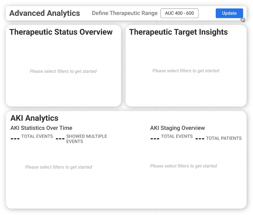
Showing all the important product features are important, however the features are currently too close together. This can overwhelm the user and leads to the website losing user retention.
PROCESS
So what do I do to fix these issues while providing creating a concise page?
Working with the sales & operations team and the business development specialist, we analyzed parts of the page that were redundant on the website and discussed the user feedback to
The Solutions
Challenge #1: What needs to be deleted or changed and what needs to be kept?
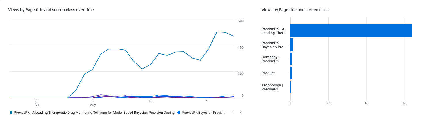
Based on the feedback gathered from the user interviews and internal discussion, I decided to remove the PrecisePK Helps You section, How PrecisePK Integrates Into Your Workflow section, and the ROI section. All 3 sections are helpful in convincing the user on the use of the product, however from monitoring the website’s analytics, the home page is the most visited page on the PrecisePK with over 1000 visitors every week. Having ROI on the home page would bring more benefit for the company in comparison to keeping in the Product Page. For the PrecisePK Helps You section and How PrecisePK Integrates into Your Workflow section, the descriptions also repeat contents on the home page. Because I want the page to focus on the product, it was removed to ensure a more optimized product page.
To direct the user’s attention to each individual product feature, I implemented a tab format that allowed users to view each one at a time. By separating the features into separate tabs, users can navigate through them and focus on the details without seeing overwhelming visual clutter.
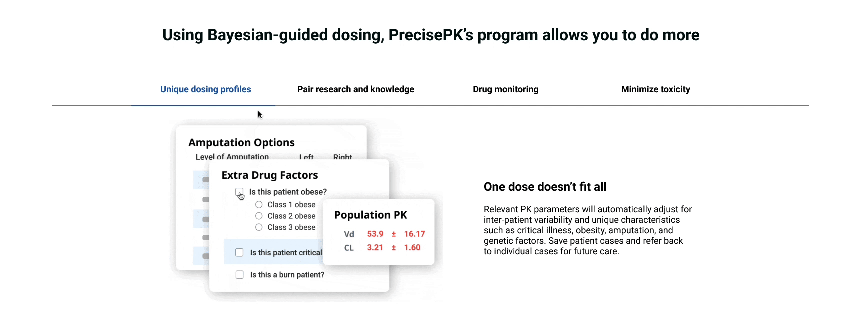
In addition to changing the structure for product features, the team recognized the importance of showcasing how versatile PrecisePK’s software can be beyond clinical hospital settings. To show this to users, I also added a section highlighting areas PrecisePK can be used in. While the software is primarily used in hospitals and clinical environments, it can also be used in research and educational settings. By emphasizing the software’s adaptability, users gain a broader understanding of PrecisePK’s capabilities.

Challenge #2: What needs to be redesigned or changed to clean the user interface of the page?
Font colors and sizes were standardized across the product page to ensure a cohesive visual experience for users. In the drug module section, the previous design involved bolding specific drugs that were popular. However, this ended up causing confusion among users, as there was no indication to why they were bolded. To address this, drugs were no longer bolded since there weren’t many inquiries on what our popular drugs were.
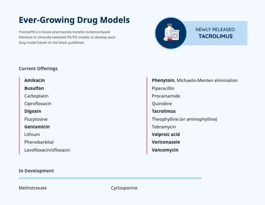
During my competitive analysis on other Bayesian dosing software companies, it revealed that users often inquire on whether we have pediatric or neonatal models. To ensure users are better informed, a legend was created address inquiries proactively and creates assurance that PrecisePK’s software caters to a comprehensive range of patient populations. Additionally, to improve the information layout and visual hierarchy. Depending on the specific drug they were looking for, users can easily locate it efficiently.
Previous drug modules section

New drug modules section
PROCESS
But what do users think of these improvements?
To be sure that these improvements were helpful for users to understand the product, I conducted more user tests and gathered feedback on the website prototype.
The Tests
To make sure the designs were user friendly and had no pain points, the product page was tested in a user interview with pharmacy students, pharmacists, and users with no healthcare background.
For the test, users were asked to:
Review the product features.
Review the drug modules offered.
Review the settings PrecisePK can be used in.
Through the usability test, users were asked to provide their input on the product page. With varying views in the field of pharmacy, I was able to gather many opinions. With the product page, users mentioned that the tab feature for the product features was much less overwhelming and easier to focus on one feature at a time.
“I like it, it’s way less overwhelming in comparison to the original one you showed and is way more digestable. There aren’t as many moving parts.”
- Sherman
In the drug module section, users highlighted that the previous drug modules was simple and straight to the point. However, after seeing the newer drug modules section, they pointed out that the new organization of drug categories allowed them to identify specific medications faster rather than scanning an entire list like before.
“It’s nice that they’re separated into categories. The original was simple and listed all the drugs but that meant I had to scan the list if I wanted to look for a specific one and I feel like I could easily miss it.”
- Phoebe
While there were no comments in the initial user interview in regards to where PrecisePK can be used, we’ve received inquiries on how and where PrecisePK can be used. Most users know the software can be used in a hospital setting, however many have also inquired using PrecisePK in their research on vancomycin and effective medication dosing. In this user interview, users mentioned that this section is helpful since it proactively informs the user that they could use the software in multiple settings.
“This is helpful, I didn’t think about where PrecisePK could be used, but if I were someone who was really curious about the program then it’s good to know before booking a demo.”
- Jenny
With no comments for change or pain points from the users, I built the product page onto Webflow.
However, despite the positive reception and user satisfaction with the redesigned product page, the CEO expressed dissatisfaction decided he wanted to go in a different direction with the product page. Although the team and I comprehensively explained the rationale behind the included sections and highlighting the positive feedback during the user interviews, the CEO determined it was better to use the previous product feature format, keeping the How Will PrecisePK Integrate Into Your Workflow section, and adding more product features and integrations into the page.
PROCESS
Adjustment time…
While the CEO was dissatisfied by the first version of the new product page, the goal was still to incorporate as much user feedback into the the second iteration of the product page.
The Improvements
In response to the CEO’s request for more product features to be displayed, the descriptions and product images were modified to comprehensively showcase a total of 7 distinct features for a more thorough representation of PrecisePK’s offerings. Due to concern for users’ being potentially overwhelmed by the number of features displayed, the features spaced further apart to incorporate more negative space. This approach aimed to create a more user-friendly interface, allowing users to focus on each feature individually without feeling overloaded with information. In order to effectively highlight the newly added features, I designed new accompanying gifs for each feature. To maintain a visually pleasing and less distracting experience for users, the speed of each gif was reduced to minimize excessive movement on the screen. I aimed to create a balance between showcasing the features and ensuring a more focused and streamlined user experience in the product page.
Two of my favorite gifs created
For the How Will PrecisePK Integrate Into Your Workflow section, 3 more integrations were added into the current list to show the wide range of integration opportunities with PrecisePK. To follow the existing format for the section, I designed 3 icons to accompany the newly added integrations:
Local Population Model developed based on your hospital’s patient population
Single Sign-On (SSO) Integration (e.g. OKTA, DUO, InCommon, SecureAuth)
High Service Level Agreement to ensure 99.9% uptime
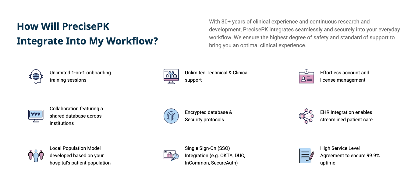
Initially the team and I discussed to show users the step-by-step process of integrating with PrecisePK, as users often inquired about the step-by-step process when trying and implementing PrecisePK software. Despite the explanation to the CEO, he decided that it was best to remove the step-by-step process. With all those changes, the second iteration of the product page was implemented into Webflow and can be viewed here.
PROCESS
Time for another test
Although the second iteration of the product page was changed to satisfy the CEO’s request, it was important to make sure the product page was still user friendly as much as possible.
The Final Test… For Now
To make sure the second iteration of the product page was user friendly but also satisfies the CEO’s requests, another user interview was conducted with pharmacy students, pharmacists, and users with no healthcare background.
For the test, users were asked to:
Review the product features
Review the How PrecisePK Will Integrate Into Your Workflow section
Gathering feedback from the user interview, users stated that the second iteration of the product page was simple and straight to the point, however the product features section seemed to go on for awhile.
“I kinda liked the first design better for the product features because now there’s more features and I have for longer now, but it’s nice that there’s more spacing between each feature this time.”
- Phoebe
“I mean yea it works, it’s less sections overall but I feel like this product features section got longer and it feels like it keeps going.”
- Harrison
This works too, and it seems more focused on the product, but it just feels really long.
- Sherman
In redesigning the product page, I was responsible for following the project from beginning to end with the PrecisePK sales & operations team and the business development specialist. Those responsibilities included conducting user interviews and usability research, conducting a competitor analysis, creating a quality user experience, and and designing the user interface for a new import process.
While the situation was not expected, it was important to include requests that can best suit the company. The second iteration of the product page ensures users are able to learn about the product and its features, as well as satisfying the CEO’s expectation on the information presented.
Through this project, I was able to:
Ensure a consistent user experience. I focused on optimizing the product page by making sure I carefully analyze the layout to best fit user expectations. It was important for me to make sure users were able to learn about PrecisePK’s software to improve conversion rates and user engagement.
Collaborate with a team. Being a product designer, I continuously have to work with different teams to create the best possible design to help grow the company. Although the initial iteration of the product page was well liked by users, the CEO’s business experience provides important opinions on how to increase growth of the company.
Maintain branding. Throughout the project, there was also a focus to maintain a uniform user interface. While creating new icons and images for the product page, I have to make sure what I create is within the company’s colors and branding to ensure consistency.
The direction in any project can easily change depending on all types of user critiques. It’s important I stay adaptable and ensure the designs I create are designed for the user, but also benefit the growth of the company.
In the End…
View my other projects!