

THE TEAM
Etania Cheng - UX Designer, Graphic Designer, Project Manager
Whitney Kong - UX Designer
Mushfiq Mammadov - UX Designer
Somesh Kusre - UX Designer, Web Developer
TOOLS
Figma
WordPress
TIMELINE
12 weeks
AT A GLANCE
MoodMe is a startup focusing on augmented reality and artificial intelligence. Their focus from the start was to create unbiased AI and be a part of developing AR for companies all over the world. Over the years, they have been able to build AR and AI software for over 150 companies all over the world; however, with the speed the company was growing at, the company needed a much more updated website.
Over the years, MoodMe’s website was becoming outdated and was starting to become difficult to use for users. My role was to redesign the company’s website to ensure user’s find the information they need about the company and products. The goal for this redesign was to ensure the website was designed with the user in mind and prioritized the user’s experience in discovering MoodMe.
First of all, what problems were users experiencing?
PROCESS
To fully understand the pain points on the website, I conducted 4 user interviews to understand what frustrations users were experiencing. I wanted to know what users experienced and ensure I prioritized those pain points in the entire process.
The Problem
To discover the pain points and frustrations others may experience in MoodMe’s website, I conducted 4 interviews with users ranging from the ages of 23-60 years old. I quickly discovered some frustrations in the website due to a lack of usability testing in the original website:
Confusing. The original website was cluttered and had many repetitive components and many pages were leading back to the same spot, but stating different things.
Overwhelming. Due to lack of organization, the website structure was create by adding individual pages to the navigation bar, leading to too many options for the user.
“I felt kind of confused, and I wasn’t 100% sure about what the company does.”
- Sherman
I’m really overwhelmed by all the options in the dropdown menu.
- Abby
There’s so many pages, I pretty much just get lost and lose interest.
- Ethan
“These are some long pages for sure, I’m getting tired of scrolling back and forth.”
- Charles
The Challenges
Challenge #1: What needs to be done to prevent users getting lost in the website and decrease the frustration?
With the current number of pages, the amount of information being provided for users is creating information overload and making users overwhelmed by what’s provided on MoodMe’s website.
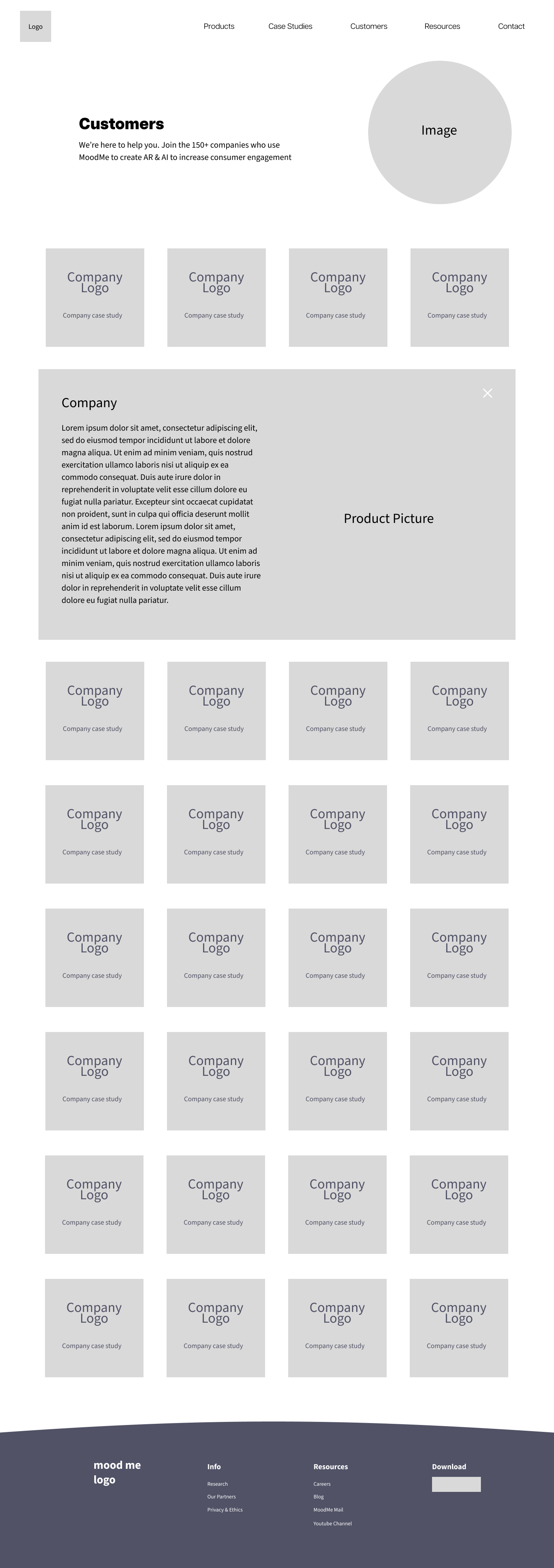
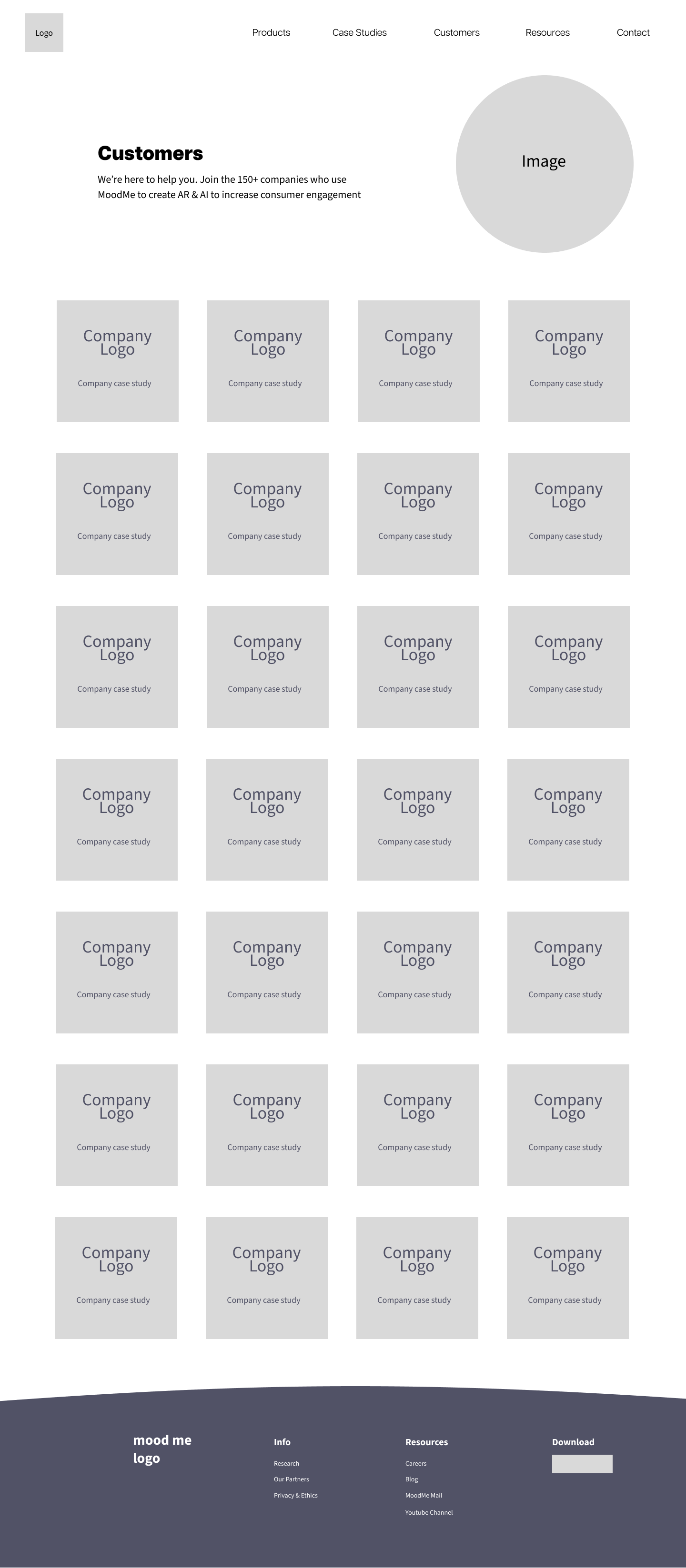
Challenge #2: How can I fix the Customers page so that I can keep all the information, but also shorten the entire page so users no longer have to scroll back and forth?
Users have a higher chance of leaving a page or site with bad user experience, causing users to leave before discovering all the companies MoodMe has done work for. The original Customers page contained a continuous page requiring users to scroll to the case study they want to see. Users also have the option to click on an individual company’s case study, where the page automatically scrolls down to that specific case study, but this also required users to manually scroll back to the top.
Challenge #3: How can I maintain MoodMe’s branding in the entire website, but also update the website’s UI?
To target the companies that are possibly looking to MoodMe for their next AR or AI product, I want to ensure the website can keep user retention and learn more about the company. With this task, the website had to be split into parts to ensure the project was completed in time. I was responsible for the Resource pages, as well as designing graphics.


Cool cool, so what can we do now to improve user pain points?
PROCESS
In the design sprint with the team, I wanted to improve the visual UI of MoodMe’s website but my main priority was to address the pain points from my interviews and designing solutions for those challenges.
The Solutions
Challenge #1: What needs to be done to prevent users getting lost in the website and decrease the frustration?
Based on the user interviews and personal observation, my first task was to narrow down the number of pages and reorganize the website structure and navigation bar. Many of the pages describes the use benefits of AR and AI in settings such as grocery stores, virtual meetings, video games, and much more. However, all the benefits were repetitive and could brought together into a single page.
The solution was to limit the number of options starting from the dropdown menu to lower the information overload on users and categorize the pages into AR Insights and AI Insights. Working with the Chief of Marketing, the final sitemap allowed users to view case studies and the AR/AI use cases.

Redesigned user flow
Challenge #2: How can I fix the Customers page so that I can keep all the information, but also shorten the entire page so users no longer have to scroll back and forth?
To ensure the Customers page still had the same content but better usability, the solution was to add a dropdown to each company, shortening the entire page. This now allows users view all the available case studies and no longer having to manually scroll back to the top of the page to select another case.
Challenge #3: How can I maintain MoodMe’s branding in the entire website, but also update the website’s UI?
To ensure the website can keep user retention and learn more about the company. I created a new style guide for MoodMe. This allows the company to continue staying consistent with their products from this point, as well as ensuring users can easily recognize MoodMe’s brand.

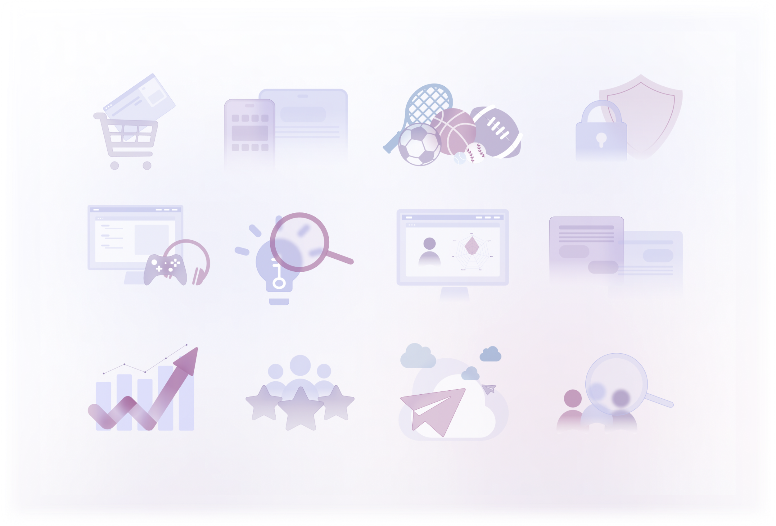
As well as creating a style guide, the next step was to create consistent illustrations that can be used throughout the website. This further creates a consistent branding for MoodMe and their website.
I got the solutions, but does it really work?
PROCESS
After understanding the problem and finding solutions, the next step was to complete more user research to ensure the solutions were designed well.
The Final Test… for now
To make sure the designs were user friendly and had no more pain points, the website was sent out to 4 users to conduct usability testing. The goal of this second usability testing was to determine the task completion success rate and the ease of use of the new website.
For the test, users were asked to:
Navigate the newly designed website and discover what products are offered to the company
View the company’s case studies and use cases
View the current demos offered by MoodMe.

Through the usability test, all the users stated that they were able to complete all 3 tasks with ease. With the users’ knowledge on the previous website, they were also able to compare the old and new version of the website.
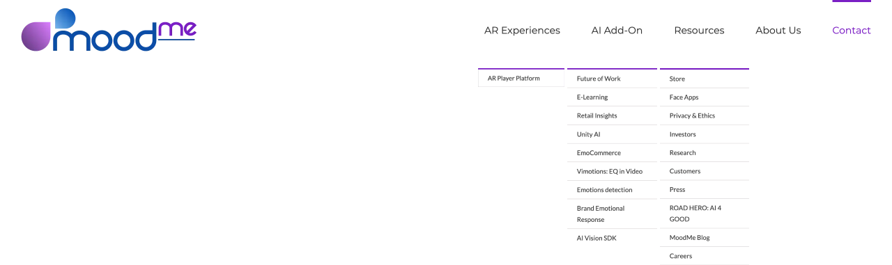
AR Experiences Before
AR Experiences After
With the updated pages, they now consist of dropdowns for each page and allow users to choose which AR Solutions they would like to learn more about.
“I’m much more intrigued about what the company offers now that I can see the uses more clearly. It makes more sense now that everything is condensed and simplified.”
- Ethan
“The pages are much easier to navigate now for sure. It helps that I no longer have to keep scrolling for an infinite amount of time to learn about uses for AR.”
- Sherman
The case studies in the Customers page is much easier to view now that the page is reformatted. I don’t have to scroll back and forth anymore, and it’s much less straining on the eyes.
- Abby
In redesigning Moodme’s website, I was responsible for following the project from beginning to end with the design team over these last 12 weeks. Those responsibilities included conducting user interviews and usability research, as well as designing the user experience and user interface for the Mobile Apps & Demos page, RoadHero page, Resources, and Customer Case Studies.
Through this project, I was able to:
Improve usability throughout the website. The website was not created with the user in mind, it was a priority to ensure the new website was tested and user feedback was applied. The website is now designed with the user in mind and no longer has any major pain points.
Collaborate with a team. As a product designer, it was important that I work well with a team. In my previous projects, I worked as the sole designer and, I didn’t need to consider other responsibilities that other team members may have. I received direct feedback from the team, which I previously wasn’t able to before.
Carried many roles. As a designer, I carried all the roles of a UX/UI designer as a generalist, but also as a project manager. I was able to follow the project from the initial concept, to the sitemap, and to current prototypes of the website, but also make sure that deadlines were met while communicating with the CEO and CMO.
Establish a design kit. This maintained consistency in the look and feel throughout the website.
However, there were many bumps in the road and with startups, there are limits on resources. The website was built on WordPress and that meant the design team had to learn to use WordPress along with creating the designs on Figma. With the lack of experience in WordPress, there were specific parts of the website that may not match the Figma designs perfectly. The team had to stay in constant communication to keep each other updated on backup plans to make sure that the user’s experience was the priority.
I’m very thankful for this opportunity to be able to be a part of MoodMe’s rebranding. It was rewarding to be able to work among fellow designers and assist in other design projects as well. Onto the next big project :)
In the End…